

Data analytics turns raw data into decisions. It moves data through pipelines into a warehouse or lakehouse, standardizes it with a semantic layer, and surfaces it in dashboards. Decision intelligence adds the final step: connecting those insights directly to repeatable, measurable business actions rather than leaving them as charts.
Walk into most companies and you will find the same imbalance. There are dozens of dashboards, several BI tools, and a lot of charts nobody fully trusts. What there usually is not is a reliable pipeline feeding them, a single agreed definition of the key metrics, or a clear line from any given chart to an actual decision. The dashboards are the visible tip of an analytics investment that is upside down: heavy at the last mile, thin everywhere it counts.
This matters because the raw material has never been more abundant or more wasted. Seagate and IDC's Rethink Data research estimated that only around a third of the data organizations collect is ever put to work, with the rest sitting dark and unused, and IDC projects the total volume of data in the world climbing toward the hundreds of zettabytes. More data has not produced more clarity. Structure has.
The analytics paradox: drowning in data, starved of decisions
The paradox is that abundance created its own problem. When every team can spin up a dashboard, you do not get one version of the truth. You get twenty, each computing "revenue" or "active user" slightly differently. Trust erodes, and the most common analytics activity in many companies becomes reconciling numbers rather than acting on them. Gartner has put the average cost of poor data quality at roughly $12.9 million a year, and most of that cost hides exactly here, in the meetings spent arguing about whose figure is right.
The fix is not another dashboard or another tool. It is treating analytics as an engineered system with distinct layers, each doing one job well.
The three layers most teams conflate

A analytics platform that produces decisions has three separable layers, and confusion between them is where most programs go wrong:
- The pipeline layer moves and transforms data from source systems into a warehouse or lakehouse, reliably and on a schedule.
- The semantic layer defines what the numbers mean, one governed definition of each business metric, so every tool downstream computes them identically.
- The decision layer connects a trusted insight to an action: a recommendation, an alert, an automated response, or a well-framed choice for a human.
Most companies build the first layer carelessly, skip the second entirely, and then wonder why the third never materializes. Get the order right and analytics stops being a reporting function and becomes a decision function.
ETL, ELT, and why the lakehouse changed the economics
The pipeline layer has quietly been re-engineered over the last few years. The old pattern, ETL, transformed data before loading it into an expensive warehouse. The modern pattern, ELT, loads raw data first and transforms it inside the warehouse or lakehouse using cheap, elastic compute. This is not a fashion; it changed the economics. Storage is inexpensive, so you keep the raw data and can reprocess it when your definitions change. Transformation becomes version-controlled code rather than a black box, which means it can be tested.
The lakehouse, one platform that serves both raw, flexible data and structured, governed tables, is what makes this practical at scale. It lets a single architecture feed BI dashboards, machine learning, and real-time applications without copying data into three separate silos.
Building trust before the data hits a dashboard
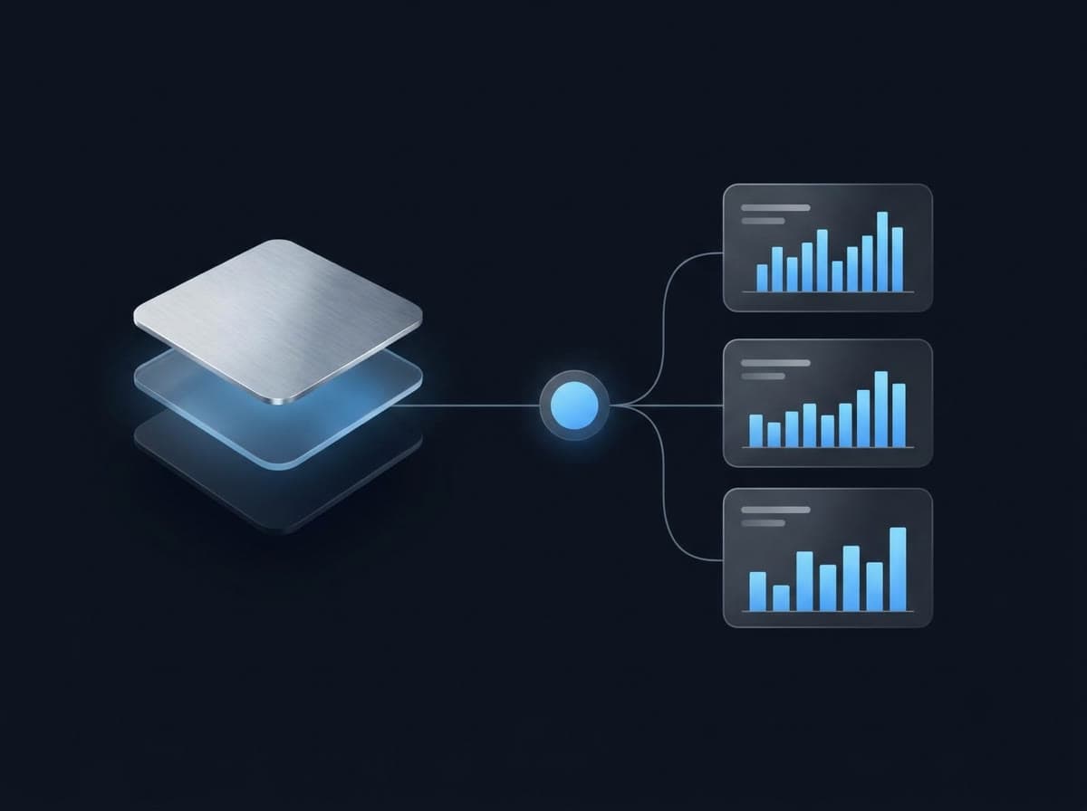
A dashboard is only as trustworthy as the transformation behind it, and this is where discipline pays off. Modern transformation is written as tested, documented code: each model has expectations attached, this column is never null, this key is unique, these totals reconcile, and the pipeline fails loudly when reality violates them. That means a broken upstream feed surfaces as an alert to the data team, not as a wrong number in front of an executive.
This testing step is the cheapest insurance in the entire stack, and it is the one most often skipped. Data quality is not a cleanup project you run once; it is a property you enforce continuously, at the point where data is transformed.
Why your dashboard lies: the case for a semantic layer
Here is the failure that quietly destroys confidence in analytics. Two teams pull "monthly active customers." One counts anyone who logged in; the other counts anyone who took a meaningful action. Both are reasonable. Both are now on slides in the same meeting, disagreeing by fifteen percent, and the conversation stops being about the business and starts being about the data.
A governed semantic layer ends this. It defines each metric once, the logic, the filters, the grain, in a central place that every dashboard, notebook, and AI tool queries through. One definition, one number, everywhere. It is the least glamorous component in the modern data stack and the one with the highest return on trust, because trust is the actual product of an analytics function.
A chart that no one trusts is worse than no chart at all. It slows the decision down while everyone relitigates the number. The job of analytics is not to produce more charts. It is to produce decisions people will stand behind.
Batch is not always enough

Most decisions are fine on a schedule; a daily or hourly batch pipeline serves reporting and planning perfectly well, and adding streaming where it is not needed just buys complexity. But some decisions live or die in seconds, catching fraud mid-transaction, personalizing a live session, reacting to an operational anomaly, or feeding an AI agent that acts in real time. For those, streaming pipelines are worth the engineering. Gartner expects real-time streaming adoption to rise steeply toward the end of the decade precisely because more decisions are moving into that second-by-second window. The discipline is knowing which decisions genuinely need it and not paying for latency you will never use.
From business intelligence to decision intelligence
The frontier is the third layer. Business intelligence hands a person a chart and trusts them to draw the right conclusion. Decision intelligence models the decision itself, the options available, the trade-offs, the likely outcomes, and either recommends an action or takes it, with a human in the loop where the stakes demand one. Augmented analytics narrows the gap further by generating the narrative automatically: not just a line going up, but what changed, why it likely changed, and what to do about it.
This is the loop worth closing: pipeline to trusted metric to decision, then measuring the outcome of that decision and feeding it back. A dashboard that is merely looked at is a cost. A decision that is made, tracked, and improved is a return.
How PEKVOR engineers the full stack
We build analytics from the plumbing up, not the dashboard down. We start by fixing the pipeline and standing up a governed semantic layer, because a beautiful dashboard on ungoverned data just industrializes distrust. We enforce data quality in code, choose batch or streaming per decision rather than by fashion, and design the decision layer so that insight connects to action instead of ending as a chart. The measure of success we hold ourselves to is not how many dashboards exist. It is whether the business makes faster, more confident decisions, and can prove they were better.
Frequently asked questions
What is the difference between business intelligence and decision intelligence?
Business intelligence describes what happened and presents it in dashboards for a person to interpret. Decision intelligence goes further by modeling the decision itself, the options, the logic, the expected outcomes, often using AI to recommend or automate an action. BI informs a human; decision intelligence engineers the decision.
What is the difference between ETL and ELT?
In ETL, data is transformed before it lands in the warehouse; in ELT, raw data is loaded first and transformed inside the warehouse or lakehouse using its own compute. Cloud warehouses and transformation tooling made ELT the modern default because it scales more cheaply and keeps raw data available for reprocessing.
What is a semantic layer and why does it matter?
A semantic layer is a governed, central definition of your business metrics, what 'revenue' or 'active customer' actually means, that sits between raw data and every tool that queries it. It guarantees everyone sees the same number for the same metric, ending the arguments where two dashboards disagree.
How much does poor data quality really cost?
Gartner has estimated the average cost of poor data quality at roughly $12.9 million per year through wasted effort, bad decisions, and missed opportunity. The cost is usually hidden because it is spread across teams reconciling conflicting numbers rather than appearing as a single line item.
Do I need real-time streaming data, or is batch enough?
It depends on the decision. Reporting and planning are well served by scheduled batch pipelines. Streaming earns its added complexity when decisions must happen in seconds, fraud detection, live personalization, operational monitoring, feeding AI agents, which is why Gartner expects streaming adoption to rise sharply through 2028.
Have a project where this matters?
This is the discipline we bring to every engagement. Tell us what you are building and we will show you how we would approach it.